Turn a Photo Into an Illustration
Name the style and name what must survive the style. Those are two different instructions, and you need both.
1 — Your photo
2 — The style
Pick a style or describe your own.
Two instructions, not one
Every good stylisation prompt contains a style and a constraint. The style tells the model what to paint with; the constraint tells it what it is not allowed to invent. Drop the second half and you get a nice illustration of something that is no longer your photo.
Compare:
- Make it a watercolour. — free rein; the composition drifts.
- Turn this into a soft watercolour illustration. Keep the composition, the pose and the main colours. — the same style, anchored to the original.
Decide how much likeness you want
This is the single choice that changes the result most, and it is not a slider — it is a sentence:
- Recognisable — "keep the facial features, the hair shape and the expression". Use for avatars, book covers, gifts.
- Loose — "loosely inspired by this photo, do not copy the features". Use for editorial illustration where a resemblance would be a problem.
Most disappointment on this kind of edit comes from people wanting a recognisable portrait but writing only the style.
A real example
Produced by this page with the instruction:
Turn this into a warm storybook illustration. Keep the composition, the pose and the main colours.
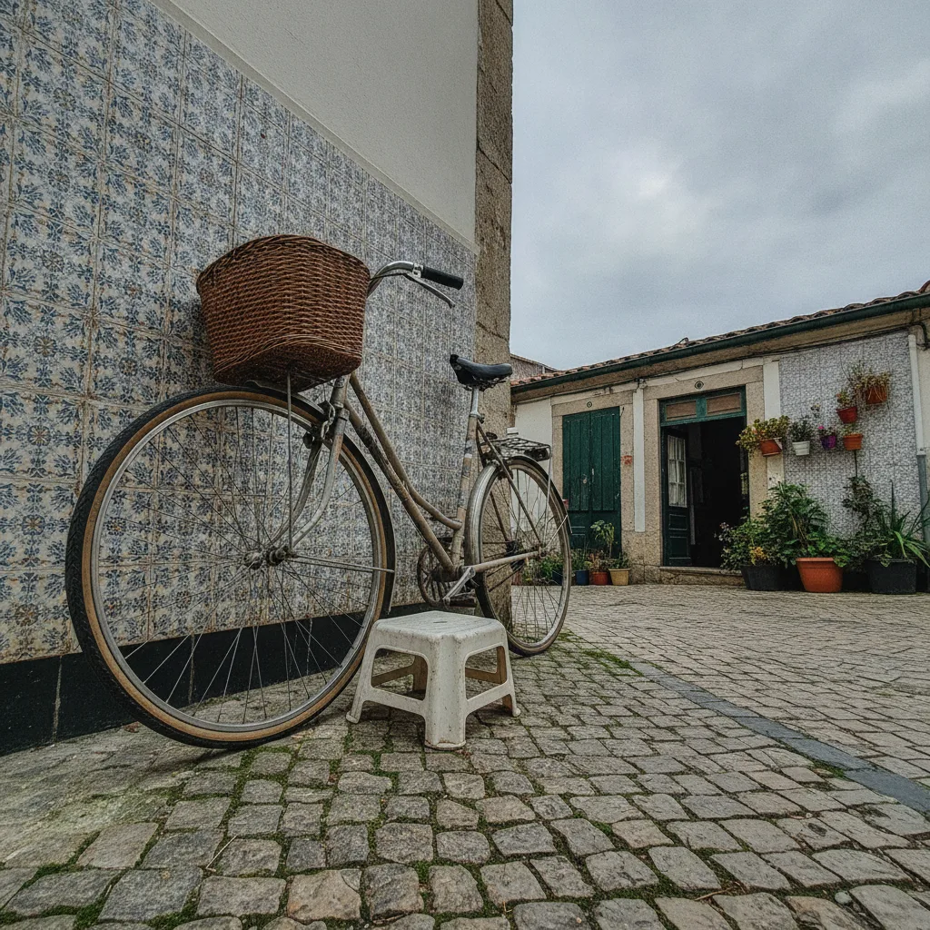 Before
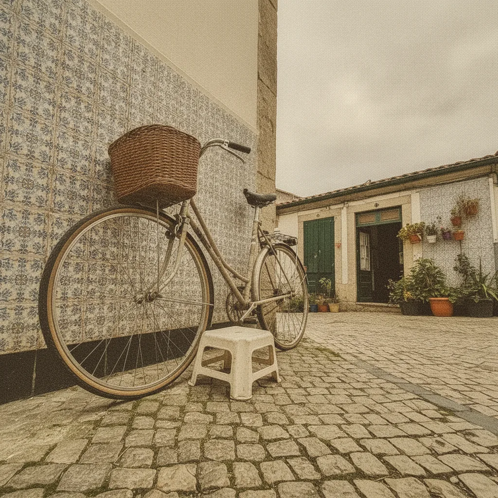 After
Market scene, storybook style
“Turn this into a warm storybook illustration. Keep the composition, the pose and the main colours.”
The composition and the gesture survive; the detail is replaced. That is the signature of a stylisation that worked — the eye still reads the original arrangement.
Styles that behave predictably
- Watercolour — forgiving, hides detail loss, good for portraits and landscapes.
- Ink line art — depends on clear edges. Works on objects and architecture, risky on faces.
- Flat vector — simplifies aggressively. Great for icons and product illustrations, poor for realistic people.
- Storybook painting — the best balance of warmth and recognisability.
- Anime / comic — works, but expect the model to redraw the face rather than stylise yours. Likeness drops sharply.
Where it breaks
- Hands — stylisation amplifies what a photo already makes ambiguous. Crop them out before the edit.
- Text — becomes shapes, which is usually correct for an illustration and usually unwanted for a book cover.
- Group photos — the model picks a focus. Stylise one person at a time.
- Low light originals — noise gets stylised into texture. Start from a clean photo.
Rights and honesty
Illustrate photos you own or have permission to use. Do not use the result to represent a real person as having said or done something they did not, and do not market the output as a named living artist's work. Both are covered in the terms of use.
Getting it right on the first run
Stylisation is cheap to retry but expensive to fix afterwards, so spend the effort before the first run. Pick a photo with one clear subject, crop out hands and clutter, and decide the likeness question in advance. Then write three things in one sentence: the medium, the mood, and the anchor. "Soft watercolour, warm afternoon light, keep the composition and the pose" is a complete brief. If the first result is close but too detailed, add "simplify the shapes and reduce the detail" rather than changing the style entirely — one clause at a time is how you converge.
Related
Need the background changed rather than the whole style? See replace background. Removing something from the scene? Use object removal.
Free edits and credits
One edit a day is free and needs no account. Credit packs start at $9.90 for 100 edits, one-off. Failed edits are never charged.
Frequently asked questions
How do I turn a photo into an illustration for free?
Upload the photo and name both the style and what should carry over — for example, turn this into a soft watercolour illustration, keep the pose and the composition. One free edit a day.
Will it still look like the person?
Partly, and you choose how much. Ask to keep the facial features for a recognisable result; ask for a loose interpretation to get a cleaner illustration that only resembles the original.
What styles work best?
Watercolour, ink line art, flat vector, risograph and soft storybook painting are consistent. Anime and comic styles work but tend to redraw faces rather than stylise them.
Can I use the result commercially?
For photos you own or have rights to, yes. Do not illustrate a real person in a way that misrepresents them, and do not reproduce a living artist's signature style as your own.
Why are the hands and text wrong?
Stylisation exaggerates the parts a photo already makes ambiguous. Crop hands out, and accept that small text will be reinterpreted as shapes.
What does it cost?
One free edit a day without an account; extra edits are one-off packs from $9.90 for 100. Failed edits are never charged.